Dobbs Ferry Food Pantry (located in South Presbyterian Church in Dobbs Ferry, NY) required a complete redesign for their website to focus on gaining donations, using a more simplistic interface.
Introduction
Dobbs Ferry Food Pantry is located in Dobbs Ferry, NY, hosted in South Presbyterian Church. The pantry serves over 60 residents and counting since the pandemic. While the food pantry is a staple of the community, like all nonprofits, much of its resources must come volunteers and donations.
The purpose of the website redesign is to make the site more accessible to residents and those looking for the pantry. The site must serve as a place to gather donations from those using PayPal, send out newsletters, and highlight the achievements of the food pantry through a blog section.
The Old Website
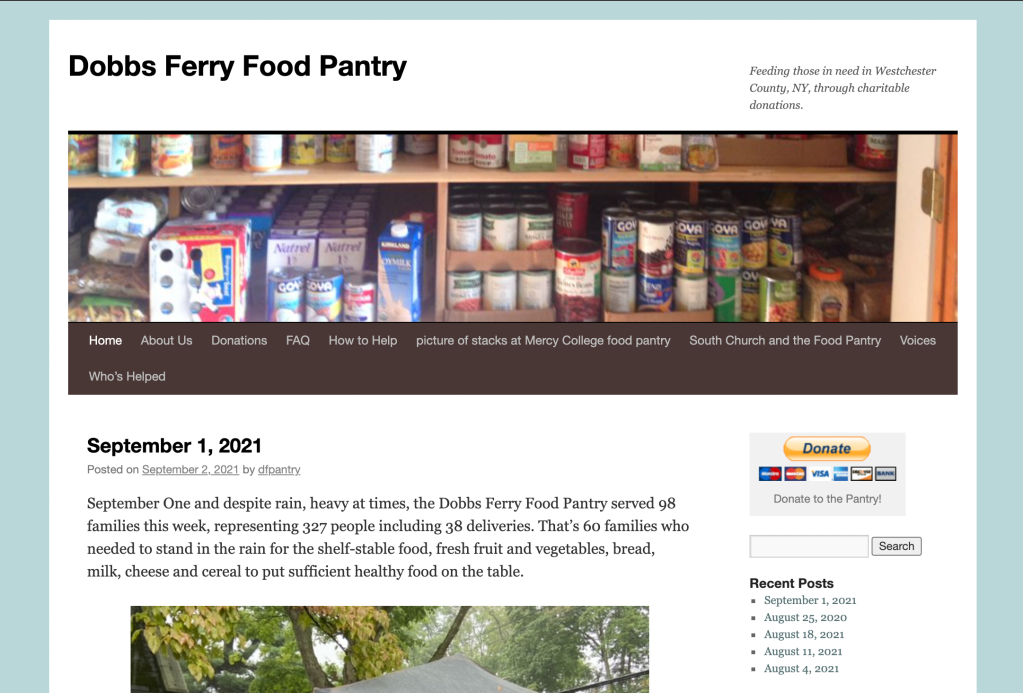
The website was launched in 2014 and includes an older format that focuses too much on the blog and not the goal of the interface: gathering donations, telling people where the food pantry is and how to help.
Inspiration
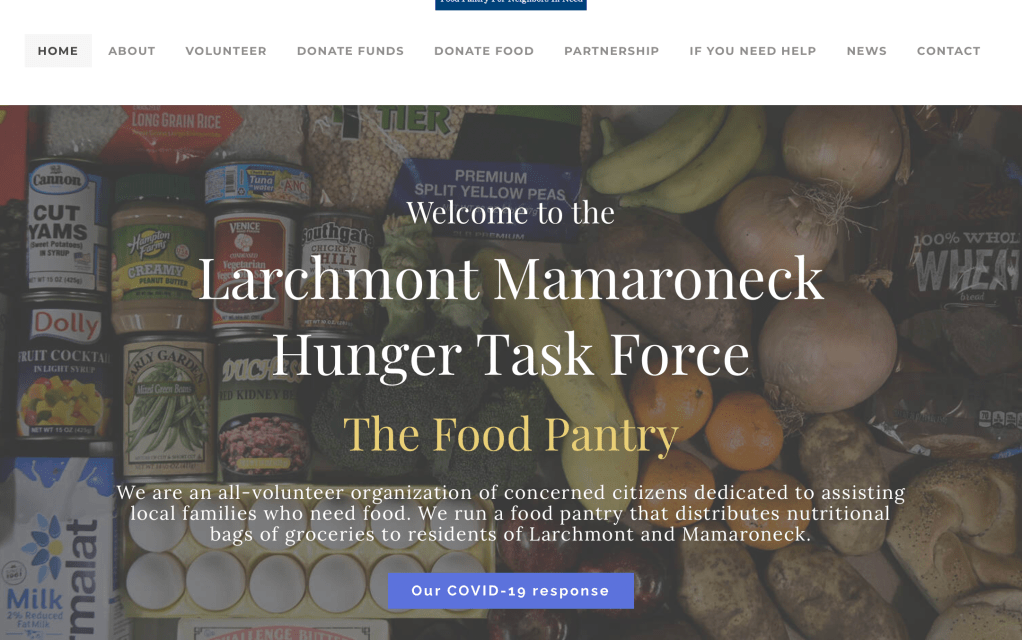
An inspiration that informed the design was The Larchmont Mamaroneck Hunger Task Force Website. I liked the hero image the block style breakdown of the site.

The idea to introduce colored buttons for the donation was also informed through observing our competitor.

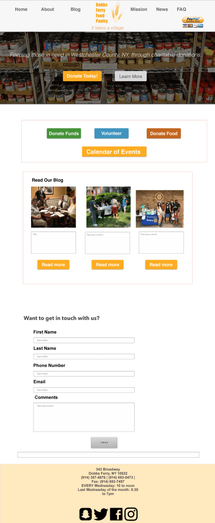
One of the key issues with the older format is that the elements like the ‘recent posts’ and ‘archives’ crowd up the website and confuse visitors, while making the donation button the secondary focus.
So in the wireframe, we focused on making multiple donate buttons to give visitors the chance to donate on multiple pages.
Wireframing in Sketch
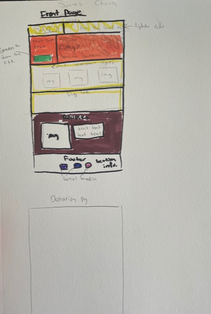

The first part of the design process was sitting down with the director and social media manager of the food pantry and drew out some rough sketches to get an idea of how to approach the redesign during the meeting.
Tackling the homepage would inform the aesthetic and structure of the rest of the pages on the site.
The second part of the design process was creating a wireframe using Sketch illustrating how the website would flow, ideal colors to capture the eye, and a minimalist aesthetic.
The navigation will have to be completely revamped, excluding unnecessary pages like “pictures of stacks at Mercy College food pantry” and “Who’s Helped”.
The Test Site

It was decided that the food pantry would allow me to make a test website using the colors from the wireframe and the main idea of focusing on the donation page. I used a test site to avoid mistakes on the actual domain, allowing for room for error and experimentation.
This is an ongoing project. Click here to view the test website.
Persona

In order to ensure the designs are tailored to the correct audience, a persona was created to bring together the characteristics of the target user to make the webpage around.
I took data from city-data.com and had a brief conversation with two volunteers and one person I know who donates to the food pantry. From there I took some notes and combined it with the data from the target geographic region of the Rivertowns (Yonkers, Hastings, Dobbs Ferry, Ardsley, Irvington, Tarrytown) to make the persona.
Figma Wireframe Revision
The director liked the first wireframe I made in Sketch. But when I tested out the elements in an actual test WordPress website, some things stood out to her.
First, she wanted to reduce the pictures down to one per page and reduce the website as a whole to about five pages. In our email chain, she says explicitly the website goal is “… to tell those in need where to find us, when we’re open (home page), and second, to encourage financial donations.” This was great information to have when thinking about a new wireframe.

I’m glad I did the test site because I showed me where it was realistic to insert block elements in a wireframe and prototype, and what the limitations of WordPress were.
We stuck with the same colors as the original plan in the new wireframe, but the focus was on having as little images as possible and highlight where people can find the pantry. I decided that embedding a Google Maps link into the WordPress home page would allow people to locate the food pantry more accurately and have the hours listed when they clicked the Maps link.
Additionally, I made it a point to reduce the elements on the home page to allow the viewer to pay closer attention to the buttons under the hero image.
With this 1st draft of the wireframe completed, our volunteer copywriter can plan the text for the site more accurately. The gibberish Greek text stands as a placeholder.

In the mobile version of the site, scaled everything down and made sure the buttons were at the forefront of the page.
I decided to keep the menu a button style navigation and not a drop down menu, since a lot of people who donate and help at the food pantry are not tech savvy.
Social Media
For this week, our class at Westchester Community College had to construct an email design and social media campaign designs for our chosen organization that we’re working on in class. I took this as an opportunity to make more designs for the food pantry. The inspirations I took from are:
Newsletter Template Email Design
For my social media examples, I decided to import them from Photoshop to Adobe XD to make a more clean presentation.
Click link to view Social media graphics in Adobe XD
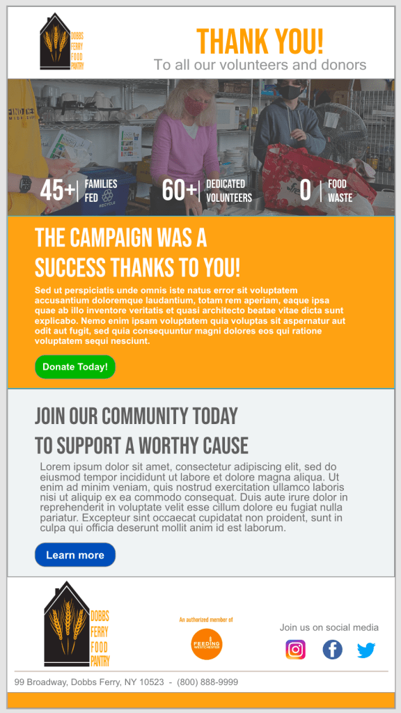
Email blast design
For any organization, emails are imperative to any digital marketing strategy. For the food pantry, I focused on an email design that targeted both new subscribers and current patrons. I separated the email into sections based on the web design: header, hero image, body, and footer to contain social media links and address info.